Thursday, 27 June 2013

The Snow Catcher~

You may have noticed a theme with some recent posts. It's Christmas in July at Down a Dirt Road Scrapbooking. Well a little wintery at least with my layouts. The adorable winter themed patterned papers are by Echo Park, the Winter Wishes Collection.


I also based this layout on a sketch. This sketch comes to you from Let's Get Sketchy.


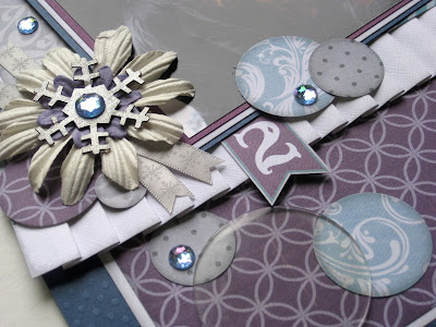
The glitter letter stickers are vintage EK Success and the glitter snowflakes are by Martha Stewart Crafts.


Patterned papers available at Down a Dirt Road Scrapbooking.

Challenge Me Happy~

To help me keep inspired under a time crunch to design I called upon another challenge. This time it comes from the challenge blog Challenge Me Happy. This weeks challenge gives you a Recipe for you to follow while creating your project. You must use all the ingredients they ask for! Here is the recipe that I followed for this layout.

Use more than 1 photo
Sewing/stitching
2 or more patterns
Washi Tape
Sequins
Use an Anchor somewhere on the layout

How is that for a challenge? I took that challenge and here is what I came up with.


Here are some of those smaller details. I created Washi Tape flags on the paper clips. I stitched the sequins to the title block, killing 2 birds with one stone. And finally the Anchor is a button from Buttons Galore & More that I painted with nail polish to match the layout!


The patterned papers are by Echo Park, Winter Wished Collection and are available at Down a Dirt Road Scrapbooking.

Wednesday, 26 June 2013

Chill Out~

I cannot tell you just how much I adore the photo that I used for this layout. When I saw these patterned papers from Echo Park's, Winter Wishes Collection...I knew they were perfect for the photo.


I loved the sketch from Sketchabilities Challenge #92, so I checked back this week. Challenge #93 doesn't disappoint either, so I thought I would give it a go.


I loved using the large acrylic circles as accents on the layout. The ribbon is by American Crafts.


These chilled out patterned paper's by Echo Park are available at Down a Dirt Road Scrapbooking.

Sticky Situation~

Do you make your own glue dots? No?!? Well I think you should try it. The ladies at The Cutting Garden showed me this little trick and I haven't looked back since. All you need is a bottle of Tack-It Over & Over, available at The Cutting Garden and non stick sheets to make the dots on. I used the backing from two 8.5x11 sticker sheets I had laying around, one as the top sheet and the other as the bottom that you create the dots on.


All I do is make my lines of dots in whatever size I want or need. Then I leave that out to dry over night, or until the glue has dried clear. Then I place my top sheet over the dots to keep them safe.
Easy as that!
I picked up my bottle of Tack-It Over & Over about 2 years ago now and I have made thousands of glue dots so far, all shapes and sizes. My bottle is still half full!

Tuesday, 25 June 2013

Me & My Peeps~

I've been busy this week working on a few projects to be posted in July. One of them is for the Me & My Peeps Blog Hop from July 16th to the 18th. I'm sure almost everyone has seen Me & My Peeps on the back of minivans and SUVs in your travels. The sweet little stick figures depicting the members of their family. Check back during the blog hop to see what else we have come up with for these little guys.


After creating my project for the blog hop I was inspired to do a little doodling of my own. If the McLennon's were peeps. Complete with some of our favorite activities. Sean's hair came out looking like a pretty tight perm....sorry about that. 


So be sure and check back on July 16-18th and browse through all the craftiness!


Challenge #58: Bring On the Sunshine~

This week at Use It Tuesday their theme is Bring On the Sunshine! I couldn't agree more with the spring we have had here, I am ready for the summer sunshine!

When I saw the challenge I knew exactly where I was going to head in my stash of goodies. I have had this line of paper for about 5 or 6 years now, left over from kits I had made up. At the time and even now it was not my favourite line of paper. But this time in creating this sunshiny layout, I've never liked it so much!

I wanted everything that I added to be monochromatic to keep with the theme. So I added some flowers and glitter leaves all from my stash. Then some buttons from Buttons Galore & More.


So if you would like to check out what the other designers came up with, or if you would like to enter a sunshiny project of your own, pop on over to Use It Tuesday!

Monday, 24 June 2013

Anatomy of a Tracy Page 2~

With summer finally here, and the weather at least this past weekend was beautiful and warm. I thought I would create a summer inspired layout. The second installment of my Anatomy of a Tracy Page series. I will take you step by step through the process of picking paper for this layout.


The layout itself is based on the sketch below from The Paper Girls Challenge Blog


So, here we go...here is what goes through my mind when I'm picking paper for a layout.
First, I knew that I was doing a summer layout so I chose Echo Park's, Hello Summer Collection. The pattern below is what I started with. A pattern that caught my eye, and will be the focal point pattern for the layout.


Then I chose a stripe. The striped pattern in a collection will often incorporate all the colours in a collection, which then pulls all your colour choices together.


I chose this third pattern because I simply liked the flags. Bonus to these patterns is that they are all double sided, so I was able to use little bits of the other side as well in the design.


Then I chose the cardstock to be used in the layout. As always I chose a dark and a light neutral, in this case being dark brown and white.
Then I chose colours to pull out, I chose the golden yellow and green.


Here is the base of my layout.


Now the layout has all of it's patterned layers.


Then finally here is the complete layout with the matted photo and stickers added for the title and embellishment.


I hope this helps you a little the next time you are standing in front of a sea of paper wondering...."What should I buy?". If you would like to take the challenge as well, stop by The Paper Girls Challenge.

Friday, 21 June 2013

Let's Get Sketchy~

I've been exploring online for some more challenge blogs for scrapbookers out there. This sketch challenge comes from Let's Get Sketchy.

Here is what I came up with this week's sketch.


Here is the sketch that I based my layout on.


The patterned papers are from Bo Bunny's, Jazmyne Collection that I have had for a long time. Perhaps because there is a lot of purple. Thank you Megan for forcing me to use them :)


I had to scour my scrap stash for about an hour to find what purple embellishments I had. I found some flowers and a K&Company sticker that I have had for who knows how long.


So if you would like a challenge, check out Let's Get Sketchy.

Thursday, 20 June 2013

Playing With Paint~

For a recent class that I taught, I got out my craft paints again. I use them from time to time when scrapbooking for stamping or stenciling. This time I used a simpler technique, a version of stamping and splattering.


Here is what you need. Paint colour of your choice, paintbrush and a toilet paper roll.


I started by dipping the toilet paper roll into the pool of paint and stamping it onto my layout.


Then dipping the paintbrush into the paint and with my finger, flicked the bristles to create splatter on the page.


A simple technique to add a little shine and texture to your layout.


Monday, 17 June 2013

The Littlest Things~

"Sometimes the littlest things take up the most room in your heart." 
A.A. Milne, Winnie the Pooh.

This quote seemed perfect for this sweet photo of Megan and Averie, from their photo shoot with Wonkeye Photography.


 The patterned papers are from Bo Bunny's, Mamma-Razzi Collection.


Parts of the title are hand written, and others used stickers from the Bo Bunny collection. The flowers are by Prima.


Sunday, 16 June 2013

Photographic Revolution: Blurry Photos~

I'm asked from time to time why it is that people's photos turn out a little blurry. Without seeing the photos there is no one answer. So I thought I would throw out some tips and perhaps you may find your reason why sometimes your photos aren't as sharp as you would like.

1. My first tip could be a simple fix, I have seen it so many times and it has happened to me a few times. Check the lens of your camera. There could be a fingerprint smudge or even sea spray. If your children handle your camera from time to time, this could happen very easily. This will make your photos look a little out of focus, even foggy. Luckily it is a simple fix, a lens cleaning cloth.

2. My second remedy is how you are holding your camera. Since the introduction of the digital camera with a viewing screen on the back, people now most often take photos with their arms straight out in front of them, so that they can see the image on the back of the camera. See the image samples below. (Thank you Zoe for being my camera model) This makes your camera and final image far more open to movement or camera shake.


Now if you pull the camera too your face or at least closer to your body with your arms tucked into your body, you gain so much more stability. Even holding your breathe while an image is being recorded can make a difference in the clarity. Your images will in turn be sharper and clearer.
With this said, there are some of the smaller digital cameras now being made without a viewfinder at all, but bringing the camera closer to you will make some difference.


 3. Make sure your camera is set to record an appropriate file size. Set too low, your photos will print pixilated (blurry looking). I always keep my camera's file size set to high. You never know when you will take that amazing photo that you may want to enlarge. If you have a DSLR you may have the option to set your camera to RAW format, unless you know how to edit this type of file, I would not use that setting. Use the highest non RAW setting available.

4. This is a common mistake we can all make. It is most common when you are taking a photo of 2 people. Most cameras are set to focus in the middle of the frame. When you have two people in a photo that means it is going to focus between them. Depending on what is in between them, the camera will more than likely focus behind them, as in the image below. The camera has focused on the hedge behind them, they have turned out blurry.


Now in order to trick the camera and keep your subjects in focus, you will have to move the middle of your camera's image to one of your subjects. Press the shutter button halfway down and focus...keep holding the shutter button and move back to the middle. Then when you press the shutter button all the way and record your image, it will be in focus.


5. For those of you with a DSLR camera with interchangeable lenses, and normally use your camera in the full automatic menus with auto focus, this may have happened to you. There is a switch on the side of each of your lenses, you will see it in the image below "AF-MF" (Auto Focus-Manual Focus).
On occasion this little switch can be knocked into MF without you even noticing. That is until the camera will no longer auto focus. The image through your viewfinder will not change at all, that is unless you focus manually by adjusting the lens yourself.
So if you all of a sudden cannot get your camera to focus, this could be your quick fix.


6. With all of this being said, there are times where there actually is a camera malfunction. Which, more often than not means that your camera will have to be sent away.

Friday, 14 June 2013

Scrapbook & Cards Today~

There seems to be a theme with my last few posts, they are all layouts that I created based on sketches. This time the sketch comes from the canadian paper crafting magazine Scrapbook & Cards Today. Here is the layout that I created.


This is the sketch that I based my layout on.


The patterned paper and coordinating embellishments are by Simple Stories, the 24/Seven Collection.


The large letter stickers are by Thickers.


The 24/Seven Collection by Simple Stories is available at The Cutting Garden.