Tuesday, 28 May 2013

Buttons and Birdcages~

One of the things I love about designing for Buttons Galore & More is the chance I get to design with some of their partner's products. In the case of this sweet birdcage, the partner is Walnut Hollow. They specialize in wood products. The moment I saw this wooden birdcage on their website, I fell in love!
Originally the birdcage was designed to be a clock, with a hole drilled in the middle for the hands and mechanics. But I knew that I would be using it as more of a canvas or showpiece. 


I used Teresa Collins, He Said, She Said Collection to cover the panels of the birdcage and create my sweet little birdie.


The buttons are from Buttons Galore & More and if you were wondering how many I used? That would be 120!


For more information on this project and a how to on getting started to create your own, head over to Buttons Galore & More. Thank you so much Walnut Hollow for the chance to work with your beautiful product!

Challenge #56: Anything Goes~

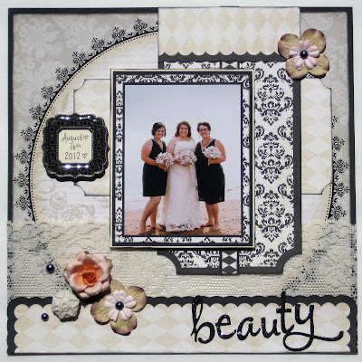
This week at Use It Tuesday the challenge theme was Anything Goes. I will admit, at first the vagueness of the challenge threw me. I have so much random product stashed away that I have had for years. So I decided to try to do a completely vintage layout. So that I did.
Everything on this layout except the photo, adhesive and liquid pearls is over 4 years old.


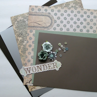
Here is a shot of some of the product I used before I started. The patterned papers are by My Mind's Eye, Lost & Found Collection. The flowers are by Prima.


Take a minute and hop over to the Use It Tuesday blog and see what the other designers have created, lots of inspiration to be had!

I based my layout on this sketch from the Cutting Garden. I try to participate every month in their sketch challenge.


Thursday, 23 May 2013

Photographic Revolution: Basic Camera Settings~

Sometimes it's just easier to leave your camera set to fully automatic aka the "green square", I get it. But you could be cheating yourself out of some great results, by simply just switching your dial over a couple of notches.

P: Program- This setting is almost full program. The camera will still choose what settings it should use, however, in this mode you can override the flash settings. A pet peeve of mine is when the flash pops up when I don't really want it. You can still have flash, you just have to tell the camera to use it.


For the rest of these settings, this just gives your camera a better idea of what you are trying to take a photo of. Instead of the camera assuming that you are taking a photo of one thing over another.

I have taken a photo of the dial that is on my DSLR, it is much like any other dial out there. Some have a few more settings, some have  fewer settings. These are the most common:

Portrait: The Head- For when you are taking a photo of one person or a few people. Not big groups.  What this is telling the camera, is that you have a focal person in mind. What is behind it doesn't matter as much. The camera then changes the focal length, making what is behind your subject a little more blurry. The reason why this setting would not be great for a large group is, if you have rows of people, the front row will be in focus, but the back row will not.

Scenery: The Mountain- this is for wide angle shots of landscapes. Also would be great for shots with people standing in front of landscapes. Kind of the opposite of the portrait mode, scenery/landscape mode keeps more of an infinite focus. more detail that you see with the naked eye will remain clear and in focus. Now for example, if you do have a person standing in front of the Peggy's Cove lighthouse, I would make sure to focus on the person. That way they would have the most clarity.

Macro: The Flower- This is for extreme close up images. Most often you think of flowers and foliage. Anything that you want a close up image of, showing as much detail as possible. Every camera and lens is slightly different as to how close you can get to an object and get focused, so it really is trial and error when in the process of taking the image.

Fast Action: The Running Guy- This setting is meant for when taking photos of people or things moving quickly. However, it is not magic. It works best outdoors with good light. This setting will not work well in an arena. Indoor action shots are one of the hardest things to photograph well. The best advice I can give you, is get as close as you possibly can and be patient.

Night Portrait: Little man with star above his head- This setting is meant for low light situations like a portrait at sunset, or imagine you are sitting at an outdoor cafe at night with beautiful romantic lighting in the background. I do like this setting, but it can be a bit tricky for both the person/people being photographed and the photographer. Essentially what the camera will do is flash first to illuminate  the person in your photograph, but then in addition to that it will leave the shutter open just a couple of seconds more, letting the camera record the ambient light that surrounds the subject (the colorful sunset, or pretty lights). But what this means is that your subject and you as the photographer have to stay VERY still while the camera's shutter is still open doing this. Having the camera on a tripod would be ideal, but you can get away with hand holding it.

With nicer weather on it's way, have fun out there and play until you get the images you want!

This & That~

The layouts in today's post are all recent layouts that I had created with no relation to one another really. Just a few random layouts for inspiration.


This layout was created using patterned papers and lacy ruffle by Webster's Pages and flowers by Prima.


Sean's 11th birthday layout is created using Crate Paper's DIY Shop Collection of patterned papers and embellishments.


The final layout is created using the Tommy Collection patterned papers and embellishments from Close to My Heart.

Wednesday, 22 May 2013

Well Travelled~

This is a layout that I created a little while back using a photo from one of my favorite places. West Point, PEI.
Daydreaming of nicer weather and red sand beaches. But until then, I will just keep crafting!

The patterned papers are from Carta Bella's, Well Travelled Collection.

Tuesday, 14 May 2013

Challenge #55: You Can't Touch This~

Well, it's that time again at Use It Tuesday! For this challenge we had to look through our stash for that beloved favorite. Something that I have purposely not used, because it was too special. I knew immediately where to go in  my scraproom to find it. I have a couple of paper stations that hold my lines of patterned paper, at the top of one of them is where I put die cut patterns I have bought that I am especially fond of. The problem with that is that I never do use them.

So here it is, I picked from the stash, these Teresa Collins black and white die cut 12x12 patterns. I used 2 of them! The other hoarded item was the lace at the bottom of the layout. That too I have been holding onto for about 4 years. Thank you Use It Tuesday for finally making me use these!


Make sure you stop by Use It Tuesday to see what the other Design Team members have come up with!

Monday, 13 May 2013

Goodies in the Mail~

Who doesn't LOVE to get things in the mail?!? Other than bills that is. Today I received 2 glorious packages. The first was this adorable red, white and blue package on the top.

I was asked to be a part of the "I Love the USA Blog Hop" hosted by Laura Kelly of Laura Kelly Designs and Jen Goode of 100 Directions.com. Of course I said YES! Even Canadians like to get crafty with red, white and blue!


Here are some of the events sponsors:

General Fabrics
Plaid
Fiskars
Coats and Clark
Buttons Galore and More
Joann Stores
Cre8Time


The fabric is designed by the fabulous Laura Kelly and is available at Joann stores. So I hope you stop back June 10-14th to check out what I have created and also take a peek at all the other designers craftiness.


Last but not least in the second big brown box......my new to me tape gun!! Yay! As some of you know, I already have a tape gun like this. However it was in a sad state. Held together with an elastic band and covered in gems. Now....what to do to dress this one up??


Thursday, 9 May 2013

The Anatomy of a "Tracy Page"~

In my years scrapbooking and teaching, the most common question I have gotten would be...
How do you pick out papers?

It is the most common struggle with crafters. So this is a post dedicated to the process that I go through when picking paper. I do have a method to my madness! So hopefully this will help you the next time you find yourself in a scrapbook store, wondering what to buy.

This is the layout I created in the end. 


In this case I did have photos in mind to scrapbook.
They had a definite camping theme, so I chose my paper accordingly.


When you are shopping there is always a patterned paper that catches your eye. This paper will normally end up be the focal pattern for your layout. For me it was this barn board leaf pattern.


Then you want to find a second pattern, one that is almost a complete contrast to the one you have already chosen. I chose the red polka dot. Paper companies make full collections of coordinating patterns, as long as you stay in that collection, you are guaranteed that the patterns will go together.


For your third pattern I always try to chose a stripe. Stripe patterns often will incorporate all the colors in the collection. It will pull everything together. I normally use the stripe as a border.


Now because I do love to use patterns, I will often pick a couple more coordinating patterns to use on my layouts. Keeping in mind, this could be something as small as a flag or part of a layered border. Also if your patterned papers are double sided, that's a huge bonus!


Next I pick out the cardstock that coordinates with my patterns. Again I always choose a dark and light neutral. In this case it is cream and chocolate brown. Depending on your patterns it could be black, white, grey or navy.

Then I pull a color out of the patterns, I chose the green.


In this layout I chose a second color, one to contrast the green. I chose the yellow.


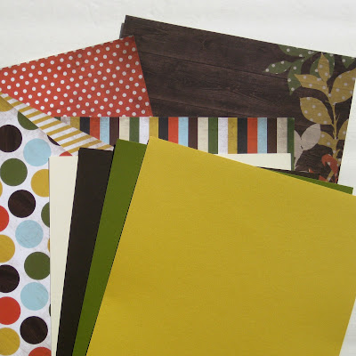
So again, here are all the patterns and cardstock that I chose. Then I added some coordinating embellishments. Some collections have matching stickers or journal tags.


So here is the finished layout again. Now you can look at it and see where all my paper choices have ended up. The anatomy of this "Tracy Page".


I used the Take a Hike Collection by Simple Stories. Available at the Cutting Garden.

Life in the Pit~

This is not my first time performing in a pit band. In the years that I have played the french horn I have provided music for productions of Fiddler on the Roof, Carousel, Guys & Dolls, West Side Story and Oklahoma. But I will admit, being a part of the production of Les Mis at the Savoy Theatre in Glace Bay, is a highlight for me! The music is spectacular! The performances onstage are shaping up to be the same.


The pit band has just joined the cast in rehearsals, and for the next couple of weeks before Opening Night on May 24th, we will be working hard to mix together to make one heck of a performance for the audience! The cast is made up of community members of all walks of life that exude talent! The pit band is made up of professional and semi professional musicians. The majority are local music teachers.


For this production they have opened up the actual pit at the Savoy Theatre, it's been decades since it has been used for anything but storage. The photo below is the view that I have from the pit. We can see very little. The audience will not be able to see us at all, unless you come up the front and peek in. If anyone out there is at one of the performances, please do come and say Hi either before the show or at intermission.


The pit band consists of 2 keyboards, 2 flutes, 1 harp, 1 trombone, 1 trumpet, 1 tuba, 1 oboe, 2 horns, 1 clarinet and percussion. Plus our musical director who keeps us all in line with what's going on onstage.

Due to popular demand, the production has added another show to the original schedule. Here are the show dates:

Friday May 24th
Saturday May 25th
Sunday May 26th
Tuesday May 28th
Wednesday May 29th
All show times are at 7pm.


So if you have not yet gotten your tickets for this top notch production, do it soon! You won't be disappointed! For more information check out the link below. Hope to see you there!

http://www.savoytheatre.com/lesmis/

Check out the video trailer for the production here:
http://vimeo.com/65102012

Tuesday, 7 May 2013

My Father My Hero~

This is a sweet little Father's Day or Father's Birthday card that I created as a part of the Gifts For Guys blog hop. The blog hop involves the Buttons Galore & More design team, the Button Bevy and the Glue Dots designers, the Glue Dotesses.

So join the Button Bevy and the Glue Dotesses in a "Gifts for Guys" blog hop on May 7th-9th 2013. 20 Great inspirational projects for the men in your life- from Dads to Grads and Babies to Boys. Two prizes, one from each company are available to those that take a gander at our gift ideas!


Products Used:


To check out the rest of the blog hop craftiness and how to be entered for prizes, just follow the link below.
http://buttonsgaloreandmore.net/buttons-and-glue-dots-blog-hope/


Here are the links to the rest of the Button Bevy:

Laura Bray~ Laura Bray Designs
Allie~ My Card Party
Laura Kelly~ Laura Kelly Designs

Make sure you join Buttons Galore & More on Pinterest, Facebook, Twitter and Google.

Monday, 6 May 2013

An Unbelievable Birthday Card~


An unbelievable birthday card for an unbelievable lady! I knew my friend Megan would share and appreciate my humor with the saying on this card. Just in case you missed it....she is not 29, nor do I weigh 100 pounds!

The patterned papers and coordinating tags are by Teresa Collins, He Said She Said Collection.


The stickers that I used for the following are by:

"29th"- K&Company
"Birthday"- EK Success
"100"- EK Success
"Friend"- Making Memories

I also used my magnetic rubber stamps by Making Memories for "Wishing You an" and "From Your".


Thursday, 2 May 2013

He Said, She Said~

As some of you may already know, I have a love for Teresa Collins Designs! This time I am working with her He Said, She Said Collection, which just happens to go beautifully with our wedding photos.

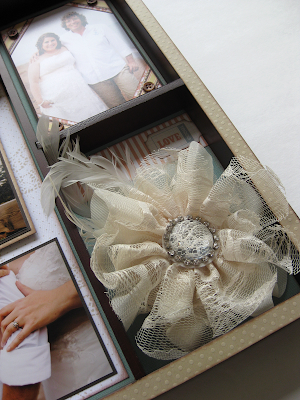
The first project I created was an altered shadow box frame that I have had laying around for about 7 years now.


I really wanted somewhere to put important memorabilia from our wedding day. This was the flower that I made to go in my hair.


Buttons from Buttons Galore & More were a great accent.


This is the boutonniere that Sean wore. I made them out of maps, just like the flowers in my bouquet. The feather was made from sheet music. Through the day it got a little rumpled, but I wanted to keep it just the way it was.


The second project I created was a scrapbook layout. With the collections name as inspiration,  He Said, She Said, I created a layout more based on journaling memories from our wedding day. I also wanted to have Sean do the journaling on his side of the layout, luckily he agreed to do it! The collection He Said, She Said has 2 coordinating packs, one more masculine and one more feminine. I used both for  this layout, so that the page had a distinct He side and She side.


The first journaling question was "What do you love most about him/her?"


The second question was "What were your fondest Wedding Day Memories?". Each of us had 5 answers.


If you LOVE the Teresa Collins, He Said, She Said Collection as much as I did. It's available at The Cutting Garden, as well as Down a Dirt Road Scrapbooking.

Wednesday, 1 May 2013

Buttons and Ribbon~

This is yet another layout that I created using the Swagger Collection by Fancy Pants. This time for a Buttons Galore & More tutorial. The masculine colors and patterns were a good match for this beach shot. The Swagger Collection is available at the Cutting Garden.


To check out the complete tutorial on how to create this layout on your own, just click on Buttons Galore & More.