Monday, 3 June 2013

A Year Has Flown By~

It is so hard to believe that it has only been a year since the day that we picked Kya up from her foster home in Halifax through the Atlantic Small Dog Rescue. She has added so much to our family, that it seems like she has always been here by our sides. The happiness that she adds to our lives on a daily basis with her antics and sweet face is priceless!

It was the Sunday immediately after marching in the Apple Blossom Parade last year, that we arranged to pick her up outside of Halifax. We then made our way to Pictou County to get our engagement photos taken by Christine of WonkyEye Photography. When we arrived Christine's sweet rescue dog Paddie was so excited to have a friend to play with. Christine and Dave have a large beautiful property in the country, she ensured us that Paddie would never lead Kya to harm. So we let Kya out of the car to run and play while we had our photos taken. The photo below is one of 2 photos that Christine got of Kya, during a quick pit stop. Then she was off again to play. Our first family photo!


Soon enough after that it was summer time, which meant her first trip to PEI to visit her Nanny and Poppy. She put them to the test the first evening we were there by eating the arm of their couch in the sun porch while we popped out for supper just up the street. But since then she has been spoiled, always getting little pieces of meat from Nanny and playing fetch in the back yard with Poppy.


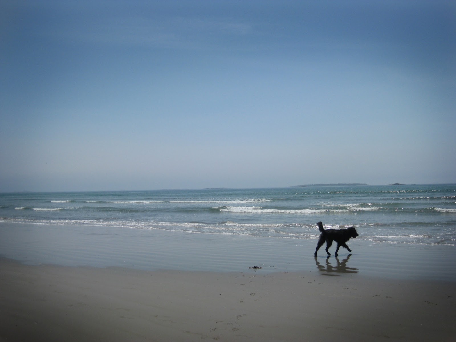
When in PEI, we LOVE going to the beach! So this year we were sure to find all the dog friendly beaches for the whole family. Blooming Point beach is a favorite so far. We soon found out that she loves to dig in the sand.


This photo makes me laugh every time. Both the look on her face and my photography skills. She LOVES the water, and will try to swim whether it's in the ocean, a lake, a pond or a puddle.


We had a good deal of beach time last summer, and we're looking forward to the same this year.

As a family we also started a new hobby last summer, geocaching. Kya loves it too! We find our hidden treasures and Kya always finds sticks!


Kya, soaking up the cuddles from Margaret at Masstown Market.


We were back and forth on the ferry last summer about 10 times if I remember correctly. Kya became a pro.


Soon after Kya came home with us we realized just how far her love of water would take her. If you are not careful she WILL get in the shower with you. Which also makes it easy to bath her when she does need it.


A snapshot I took while decorating the Christmas tree. She always keeps an eye on what we do, rarely are we out of her sight. so when I needed to lay the lights down to test them...she was on the couch next to the plug. She wasn't bothered in the least.


Turns out she loves the snow almost as much as she loves the water. She could be a professional snow catcher.


We could not thank the Atlantic Small Dog Rescue enough for all that they do to find forever homes for all the sweet animals that come their way big AND small. Our family is forever changed for the better.

A Few Great Days~

I have had a pretty great weekend of fun, festivities and news! Today was a continuation when the mailman left my summer issue of Canadian Scrapbooker magazine. A layout that I submitted showed up 3 times in the publication, and I am thrilled!


First was on a subscription page, "Never miss an issue!".


Next was the full page next to the introduction to that section of the magazine, Photobooth Fun.


Then the actual full page of the layout itself. The magazine had a call for layouts with photobooth photos as the theme. This was one of my favorites from our wedding, so I had fun creating the layout and took the chance submitting it. Before I knew it I got the email asking me to send the layout their way for publication.


In case you missed it, I found out yesterday when catching up online, that I was named May's Featured Fan for Teresa Collins Designs. Teresa Collins has to currently be my favorite designer! I adore her collections of product! So to be given the chance to be a featured fan, is beyond fantastic for me!
To check out the Teresa Collins post click HERE.


Tuesday, 28 May 2013

Buttons and Birdcages~

One of the things I love about designing for Buttons Galore & More is the chance I get to design with some of their partner's products. In the case of this sweet birdcage, the partner is Walnut Hollow. They specialize in wood products. The moment I saw this wooden birdcage on their website, I fell in love!
Originally the birdcage was designed to be a clock, with a hole drilled in the middle for the hands and mechanics. But I knew that I would be using it as more of a canvas or showpiece. 


I used Teresa Collins, He Said, She Said Collection to cover the panels of the birdcage and create my sweet little birdie.


The buttons are from Buttons Galore & More and if you were wondering how many I used? That would be 120!


For more information on this project and a how to on getting started to create your own, head over to Buttons Galore & More. Thank you so much Walnut Hollow for the chance to work with your beautiful product!

Challenge #56: Anything Goes~

This week at Use It Tuesday the challenge theme was Anything Goes. I will admit, at first the vagueness of the challenge threw me. I have so much random product stashed away that I have had for years. So I decided to try to do a completely vintage layout. So that I did.
Everything on this layout except the photo, adhesive and liquid pearls is over 4 years old.


Here is a shot of some of the product I used before I started. The patterned papers are by My Mind's Eye, Lost & Found Collection. The flowers are by Prima.


Take a minute and hop over to the Use It Tuesday blog and see what the other designers have created, lots of inspiration to be had!

I based my layout on this sketch from the Cutting Garden. I try to participate every month in their sketch challenge.


Thursday, 23 May 2013

Photographic Revolution: Basic Camera Settings~

Sometimes it's just easier to leave your camera set to fully automatic aka the "green square", I get it. But you could be cheating yourself out of some great results, by simply just switching your dial over a couple of notches.

P: Program- This setting is almost full program. The camera will still choose what settings it should use, however, in this mode you can override the flash settings. A pet peeve of mine is when the flash pops up when I don't really want it. You can still have flash, you just have to tell the camera to use it.


For the rest of these settings, this just gives your camera a better idea of what you are trying to take a photo of. Instead of the camera assuming that you are taking a photo of one thing over another.

I have taken a photo of the dial that is on my DSLR, it is much like any other dial out there. Some have a few more settings, some have  fewer settings. These are the most common:

Portrait: The Head- For when you are taking a photo of one person or a few people. Not big groups.  What this is telling the camera, is that you have a focal person in mind. What is behind it doesn't matter as much. The camera then changes the focal length, making what is behind your subject a little more blurry. The reason why this setting would not be great for a large group is, if you have rows of people, the front row will be in focus, but the back row will not.

Scenery: The Mountain- this is for wide angle shots of landscapes. Also would be great for shots with people standing in front of landscapes. Kind of the opposite of the portrait mode, scenery/landscape mode keeps more of an infinite focus. more detail that you see with the naked eye will remain clear and in focus. Now for example, if you do have a person standing in front of the Peggy's Cove lighthouse, I would make sure to focus on the person. That way they would have the most clarity.

Macro: The Flower- This is for extreme close up images. Most often you think of flowers and foliage. Anything that you want a close up image of, showing as much detail as possible. Every camera and lens is slightly different as to how close you can get to an object and get focused, so it really is trial and error when in the process of taking the image.

Fast Action: The Running Guy- This setting is meant for when taking photos of people or things moving quickly. However, it is not magic. It works best outdoors with good light. This setting will not work well in an arena. Indoor action shots are one of the hardest things to photograph well. The best advice I can give you, is get as close as you possibly can and be patient.

Night Portrait: Little man with star above his head- This setting is meant for low light situations like a portrait at sunset, or imagine you are sitting at an outdoor cafe at night with beautiful romantic lighting in the background. I do like this setting, but it can be a bit tricky for both the person/people being photographed and the photographer. Essentially what the camera will do is flash first to illuminate  the person in your photograph, but then in addition to that it will leave the shutter open just a couple of seconds more, letting the camera record the ambient light that surrounds the subject (the colorful sunset, or pretty lights). But what this means is that your subject and you as the photographer have to stay VERY still while the camera's shutter is still open doing this. Having the camera on a tripod would be ideal, but you can get away with hand holding it.

With nicer weather on it's way, have fun out there and play until you get the images you want!

This & That~

The layouts in today's post are all recent layouts that I had created with no relation to one another really. Just a few random layouts for inspiration.


This layout was created using patterned papers and lacy ruffle by Webster's Pages and flowers by Prima.


Sean's 11th birthday layout is created using Crate Paper's DIY Shop Collection of patterned papers and embellishments.


The final layout is created using the Tommy Collection patterned papers and embellishments from Close to My Heart.

Wednesday, 22 May 2013

Well Travelled~

This is a layout that I created a little while back using a photo from one of my favorite places. West Point, PEI.
Daydreaming of nicer weather and red sand beaches. But until then, I will just keep crafting!

The patterned papers are from Carta Bella's, Well Travelled Collection.

Tuesday, 14 May 2013

Challenge #55: You Can't Touch This~

Well, it's that time again at Use It Tuesday! For this challenge we had to look through our stash for that beloved favorite. Something that I have purposely not used, because it was too special. I knew immediately where to go in  my scraproom to find it. I have a couple of paper stations that hold my lines of patterned paper, at the top of one of them is where I put die cut patterns I have bought that I am especially fond of. The problem with that is that I never do use them.

So here it is, I picked from the stash, these Teresa Collins black and white die cut 12x12 patterns. I used 2 of them! The other hoarded item was the lace at the bottom of the layout. That too I have been holding onto for about 4 years. Thank you Use It Tuesday for finally making me use these!


Make sure you stop by Use It Tuesday to see what the other Design Team members have come up with!

Monday, 13 May 2013

Goodies in the Mail~

Who doesn't LOVE to get things in the mail?!? Other than bills that is. Today I received 2 glorious packages. The first was this adorable red, white and blue package on the top.

I was asked to be a part of the "I Love the USA Blog Hop" hosted by Laura Kelly of Laura Kelly Designs and Jen Goode of 100 Directions.com. Of course I said YES! Even Canadians like to get crafty with red, white and blue!


Here are some of the events sponsors:

General Fabrics
Plaid
Fiskars
Coats and Clark
Buttons Galore and More
Joann Stores
Cre8Time


The fabric is designed by the fabulous Laura Kelly and is available at Joann stores. So I hope you stop back June 10-14th to check out what I have created and also take a peek at all the other designers craftiness.


Last but not least in the second big brown box......my new to me tape gun!! Yay! As some of you know, I already have a tape gun like this. However it was in a sad state. Held together with an elastic band and covered in gems. Now....what to do to dress this one up??


Thursday, 9 May 2013

The Anatomy of a "Tracy Page"~

In my years scrapbooking and teaching, the most common question I have gotten would be...
How do you pick out papers?

It is the most common struggle with crafters. So this is a post dedicated to the process that I go through when picking paper. I do have a method to my madness! So hopefully this will help you the next time you find yourself in a scrapbook store, wondering what to buy.

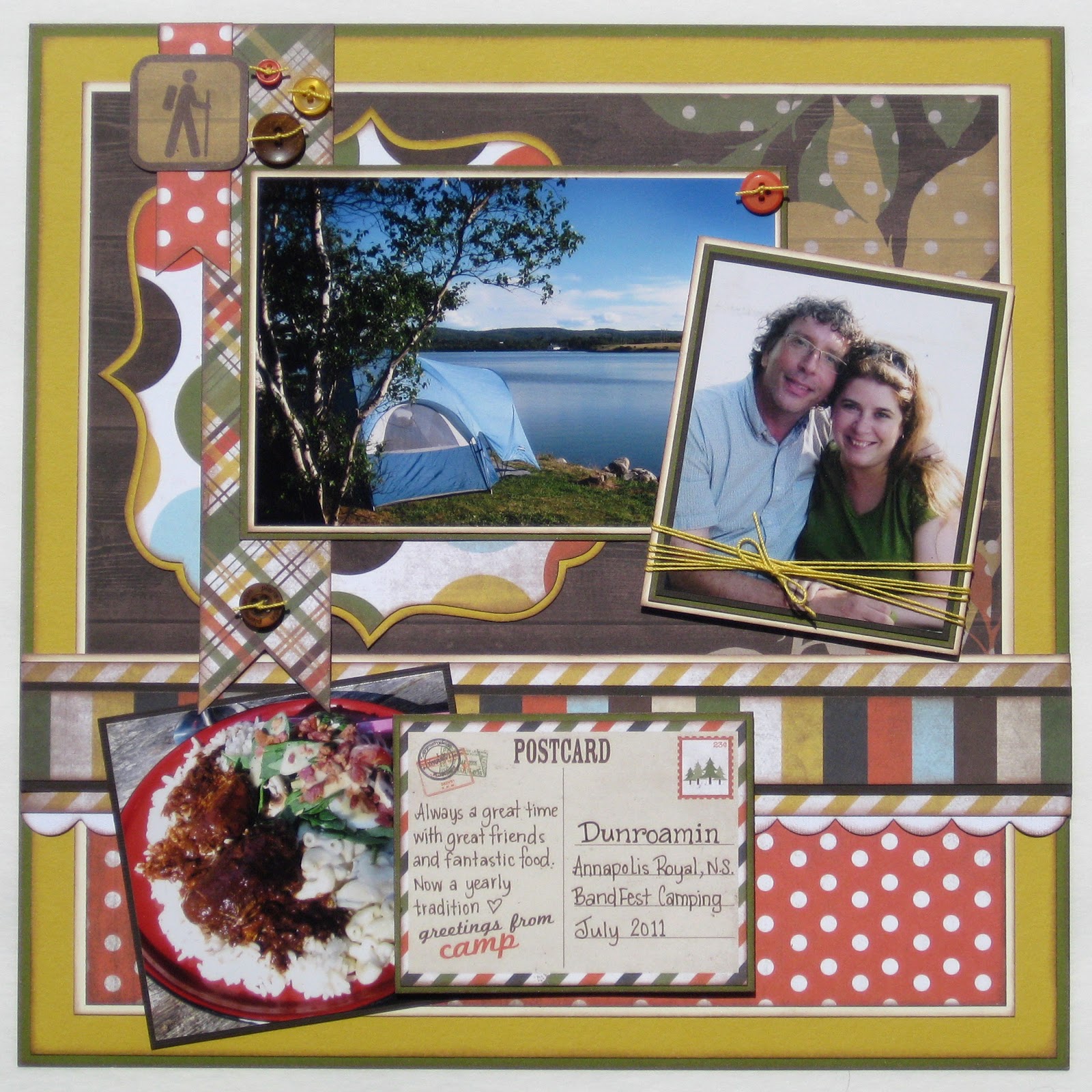
This is the layout I created in the end. 


In this case I did have photos in mind to scrapbook.
They had a definite camping theme, so I chose my paper accordingly.


When you are shopping there is always a patterned paper that catches your eye. This paper will normally end up be the focal pattern for your layout. For me it was this barn board leaf pattern.


Then you want to find a second pattern, one that is almost a complete contrast to the one you have already chosen. I chose the red polka dot. Paper companies make full collections of coordinating patterns, as long as you stay in that collection, you are guaranteed that the patterns will go together.


For your third pattern I always try to chose a stripe. Stripe patterns often will incorporate all the colors in the collection. It will pull everything together. I normally use the stripe as a border.


Now because I do love to use patterns, I will often pick a couple more coordinating patterns to use on my layouts. Keeping in mind, this could be something as small as a flag or part of a layered border. Also if your patterned papers are double sided, that's a huge bonus!


Next I pick out the cardstock that coordinates with my patterns. Again I always choose a dark and light neutral. In this case it is cream and chocolate brown. Depending on your patterns it could be black, white, grey or navy.

Then I pull a color out of the patterns, I chose the green.


In this layout I chose a second color, one to contrast the green. I chose the yellow.


So again, here are all the patterns and cardstock that I chose. Then I added some coordinating embellishments. Some collections have matching stickers or journal tags.


So here is the finished layout again. Now you can look at it and see where all my paper choices have ended up. The anatomy of this "Tracy Page".


I used the Take a Hike Collection by Simple Stories. Available at the Cutting Garden.